Porch color schemes for a cohesive look can make a big impact on the overall display of your home. When you have a cohesive color scheme, your porch becomes an inviting space that adds to your home’s curb appeal. Choosing the right colors can be a daunting task, but with a few tips, you can create a beautiful and cohesive look for your porch.

10 Porch color schemes for a cohesive look
Contents
- 1 10 Porch color schemes for a cohesive look
- 2 How do I choose a porch color scheme for a cohesive look?
- 3 Which porch color schemes are best for a traditional look?
- 4 How can I make my porch look cohesive with a limited color palette?
- 5 Can I mix and match different porch color schemes for a cohesive look?
- 6 How do I incorporate accents into my porch color scheme for a cohesive look?
- 7 What are some porch color schemes for a coastal-inspired look?
- 8 Which porch color schemes work best for a modern look?
- 9 How do I create a cohesive porch color scheme with different materials?
- 10 Can I use a bold porch color scheme for a cohesive look?
- 11 How do I create a cohesive porch color scheme for a small porch?
- 12 What are some porch color schemes for a rustic look?
- 13 Which porch color schemes work best for a farmhouse-style porch?
- 14 Final remarks on porch color schemes for a cohesive look
Choosing the right porch color scheme can be a daunting task, but it’s an easy way to create a cohesive and inviting look. Whether you’re going for a traditional or modern style, there are endless possibilities when it comes to porch color combinations. Here are 10 porch color schemes to help you create a cohesive look:
Blue and white: A classic color combination that never goes out of style. Use a deep navy blue on the porch floor and a crisp white on the porch railings and trim.
Gray and yellow: For a more modern look, try a cool gray on the porch floor and a sunny yellow on the porch ceiling.
Green and brown: Use a deep forest green on the porch floor and a rich brown on the porch railings and trim for a natural, earthy look.
Black and white: For a bold and dramatic look, use black on the porch floor and a bright white on the porch railings and trim.
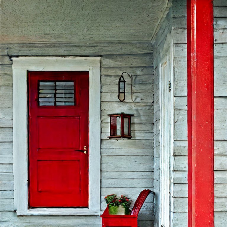
Red and beige: Use a warm red on the porch floor and a neutral beige on the porch railings and trim for a cozy, inviting look.
Orange and blue: Use a vibrant orange on the porch floor and a soft blue on the porch railings and trim for a playful and energetic look.
Pink and gray: Use a pale pink on the porch floor and a cool gray on the porch railings and trim for a feminine and sophisticated look.
Purple and green: Use a deep purple on the porch floor and a fresh green on the porch railings and trim for a whimsical and fun look.
Brown and cream: Use a warm brown on the porch floor and a creamy white on the porch railings and trim for a rustic and cozy look.
Teal and yellow: Use a bright teal on the porch floor and a sunny yellow on the porch railings and trim for a cheerful and summery look.
Remember, the key to a cohesive porch color scheme is to choose colors that complement each other and tie everything together. Experiment with different combinations until you find the perfect look for your home.
How do I choose a porch color scheme for a cohesive look?
Choosing a porch color scheme for a cohesive look can be overwhelming. However, there are a few things you can consider to make the process easier. First, take a look at the existing colors on your home’s exterior.
You want to choose colors that complement or contrast in a complementary way with those existing colors. If your home’s exterior is neutral, consider adding a pop of color to the porch to make it stand out. On the other hand, if your home’s exterior already has a lot of color, consider a more neutral porch color scheme to create balance.
Another thing to consider when choosing a porch color scheme is the mood you want to create. Do you want your porch to feel warm and inviting, or cool and modern? Warm colors like reds, oranges, and yellows can create a cozy feel, while cooler colors like blues and greens can create a more tranquil and refreshing feel.
Also, take into account the amount of natural light your porch gets throughout the day. Darker colors tend to absorb light, so they might not be the best choice for a porch that doesn’t get much sun.
Ultimately, choosing a porch color scheme comes down to personal preference. Don’t be afraid to experiment with different color combinations until you find one that feels right to you. The key is to choose colors that complement each other and create a cohesive look that ties everything together.

Which porch color schemes are best for a traditional look?
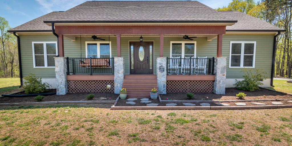
If you’re looking to create a traditional porch color scheme, there are a few classic color combinations that work well. One of the most popular traditional color schemes is blue and white. A deep navy blue on the porch floor paired with crisp white on the porch railings and trim creates a classic and timeless look.
Another classic color scheme is green and brown. A deep forest green on the porch floor with a rich brown on the porch railings and trim creates a natural and earthy feel that is perfect for a traditional style.
For a more elegant and refined traditional look, consider a black and white color scheme. Black on the porch floor with bright white on the porch railings and trim creates a bold and dramatic contrast that never goes out of style.
Another option is a red and beige color scheme. A warm red on the porch floor paired with a neutral beige on the porch railings and trim creates a cozy and inviting feel that is perfect for a traditional home. When it comes to creating a traditional porch color scheme, it’s important to choose colors that are timeless and classic, and that complement the style of your home.
How can I make my porch look cohesive with a limited color palette?
Having a limited color palette can actually make it easier to create a cohesive porch color scheme. One way to make your porch look cohesive with a limited color palette is to stick with neutral colors.
Shades of white, gray, and beige can create a classic and sophisticated look that is easy to coordinate with other elements on your porch. Another way to create a cohesive look is to choose colors that are similar in tone. For example, if you choose a light blue for your porch floor, stick with other soft and muted shades of blue for your railings, trim, and accents.
Another way to make your porch look cohesive with a limited color palette is to choose one main color and use it in different shades and textures throughout your porch. For example, if you choose a soft green as your main color, use different shades of green for your porch floor, railings, and trim.
You can also add texture by incorporating different materials, like a woven rug or textured throw pillows, in shades of green. This will create a cohesive look that feels intentional and well thought out.
Can I mix and match different porch color schemes for a cohesive look?
Mixing and matching different porch color schemes can create a unique and interesting look for your porch, but it can also be a bit tricky to achieve a cohesive look. One way to mix and match porch color schemes is to choose one color as the main theme and then use accents of other colors to add interest and variety.
For example, if your main color scheme is blue and white, you can add pops of yellow or green through throw pillows or decorative accessories. This will create a cohesive look while still allowing you to incorporate different colors.
Another way to mix and match different porch color schemes is to choose complementary colors that work well together. For example, if your main color scheme is gray and white, you can add pops of navy blue or dark green to create contrast and interest.
The key is to choose colors that complement each other and create a balanced look. You can also mix and match different textures and patterns to add depth and dimension to your porch design. By choosing complementary colors and mixing textures and patterns, you can create a cohesive look that is unique and visually appealing.

How do I incorporate accents into my porch color scheme for a cohesive look?
Incorporating accents is a great way to add interest and personality to your porch color scheme while still maintaining a cohesive look. One way to incorporate accents is to use pops of color throughout your porch design.
For example, if your porch color scheme is neutral, you can add colorful throw pillows or a bright area rug to create contrast and visual interest. When choosing accent colors, look for colors that complement your main color scheme and add a pop of visual interest.
Another way to incorporate accents into your porch color scheme is to use different patterns and textures. Mixing different patterns like stripes and florals can add depth and dimension to your porch design.
You can also add texture through different materials like woven throws or baskets. When incorporating different patterns and textures, make sure to choose colors that complement your main color scheme to create a cohesive look.
Incorporating accents into your porch color scheme is a great way to add personality and visual interest. Adding pops of color, mixing patterns, and incorporating different textures can create a cohesive look that is unique and visually appealing.
When incorporating accents, make sure to choose colors and patterns that complement your main color scheme to create a cohesive and well thought out design.
What are some porch color schemes for a coastal-inspired look?
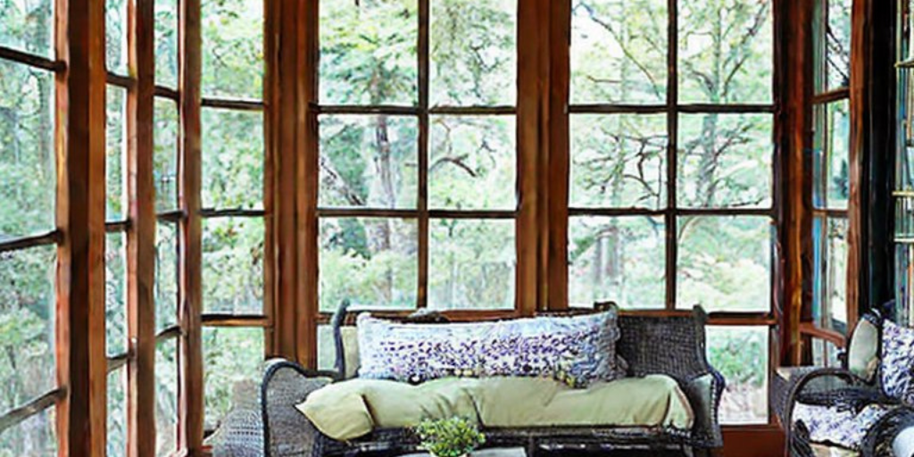
Porch color schemes for a coastal-inspired look often incorporate soft, muted colors that reflect the colors of the ocean and the beach. One popular color scheme for a coastal-inspired porch is blue and white.
This classic color combination creates a fresh and airy feel that is perfect for a porch by the sea. Use different shades of blue for your porch floor, railings, and trim, and pair them with crisp white accents like a white wicker furniture set or white throw pillows.
Another popular porch color scheme for a coastal-inspired look is a combination of sandy beige and cool blue-green. This color scheme reflects the colors of the sand and the sea and creates a relaxing and soothing vibe.
Use sandy beige for your porch floor and pair it with soft blue-green accents like a painted ceiling or a woven rug. You can also add pops of green through potted plants or decorative accessories to create a fresh and natural look.
Porch color schemes for a coastal-inspired look often incorporate soft, muted colors that reflect the colors of the ocean and the beach. Blue and white and sandy beige with blue-green accents are popular color schemes that create a fresh and relaxing feel.
When choosing a porch color scheme for a coastal-inspired look, think about the colors and textures of the beach and the sea, and choose colors that reflect the natural beauty of the coast.
Which porch color schemes work best for a modern look?
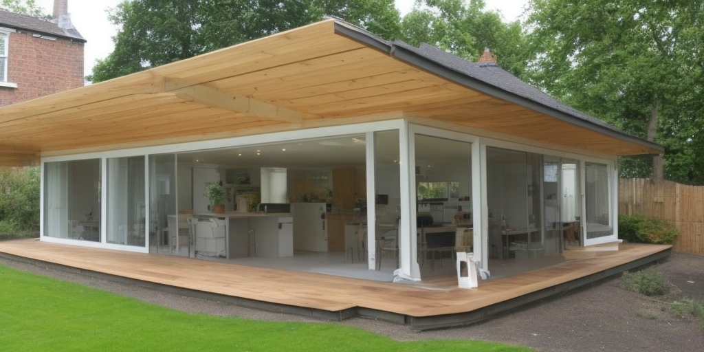
When it comes to porch color schemes for a modern look, neutral colors with bold accents are a popular choice. A monochromatic color scheme using shades of gray, black, and white creates a modern and sophisticated feel.
You can also incorporate bold accents like a bright red front door or a vibrant blue patterned rug to add visual interest and contrast. Using metallic accents like silver or gold can also add a touch of glamour to your modern porch design.
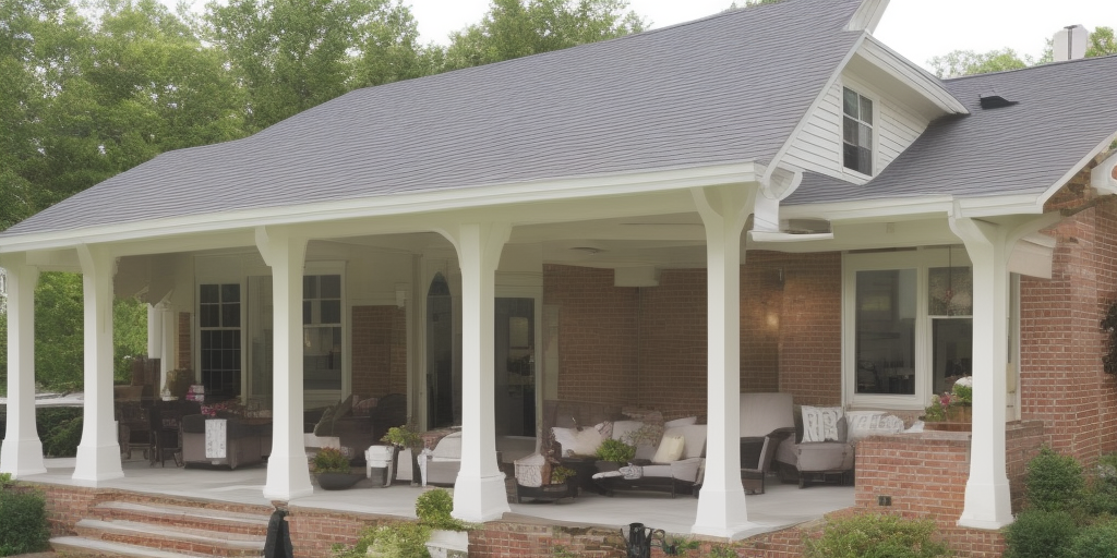
Another popular porch color scheme for a modern look is a combination of white and natural wood tones. White creates a clean and bright feel, while natural wood tones add warmth and texture. This color scheme is perfect for a modern farmhouse style porch.
Use white for your porch railings and trim and pair it with natural wood tones for your porch floor and furniture. You can also add pops of green through potted plants or a green accent wall to create a fresh and natural feel.
Porch color schemes for a modern look often use neutral colors with bold accents or a combination of white and natural wood tones. A monochromatic color scheme using shades of gray, black, and white creates a modern and sophisticated feel, while white and natural wood tones create a modern farmhouse style.
When choosing a porch color scheme for a modern look, think about creating a clean and bright feel with pops of bold color or adding warmth and texture with natural wood tones.

How do I create a cohesive porch color scheme with different materials?
Creating a cohesive porch color scheme with different materials can be challenging, but it is possible with some planning and creativity. One way to create a cohesive color scheme is to choose a dominant color and use it in different shades throughout your porch design.
For example, if you have a wooden porch floor, you can use a light gray shade for your porch railings and a darker gray shade for your furniture. This creates a cohesive look by using the same color in different shades throughout your porch design.
Another way to create a cohesive porch color scheme with different materials is to use a complementary color scheme. Complementary colors are colors that are opposite each other on the color wheel, like blue and orange or red and green.
By using complementary colors in your porch design, you can create a cohesive look that is visually appealing. For example, if you have a brick porch floor, you can use blue accents like a blue painted ceiling or blue patterned throw pillows to create a complementary color scheme.
Creating a cohesive porch color scheme with different materials requires some planning and creativity. Using a dominant color in different shades or a complementary color scheme can help create a cohesive look that is visually appealing.
When choosing colors, consider the materials used in your porch design and choose colors that complement each other. With some thought and planning, you can create a beautiful and cohesive porch color scheme that is sure to impress.
Can I use a bold porch color scheme for a cohesive look?
Yes, you can use a bold porch color scheme for a cohesive look. Bold colors can add visual interest and personality to your porch design, and they can also create a cohesive look if used strategically. When using bold colors, it’s important to balance them with neutral colors to avoid overwhelming your porch design.
For example, if you have a bold red front door, you can balance it with white porch railings and a gray porch floor. This creates a cohesive look by using a bold color as an accent and neutral colors as the dominant colors.
Another way to use a bold porch color scheme for a cohesive look is to choose colors that complement each other. Complementary colors are colors that are opposite each other on the color wheel, like blue and orange or red and green.
By using complementary colors in your porch design, you can create a cohesive look that is visually appealing. For example, if you have a blue porch floor, you can use orange accents like a patterned orange rug or orange throw pillows to create a complementary color scheme.
Balancing bold colors with neutral colors and using complementary colors can help create a visually appealing and cohesive porch design. When choosing a bold color scheme, consider the materials used in your porch design and choose colors that complement each other.
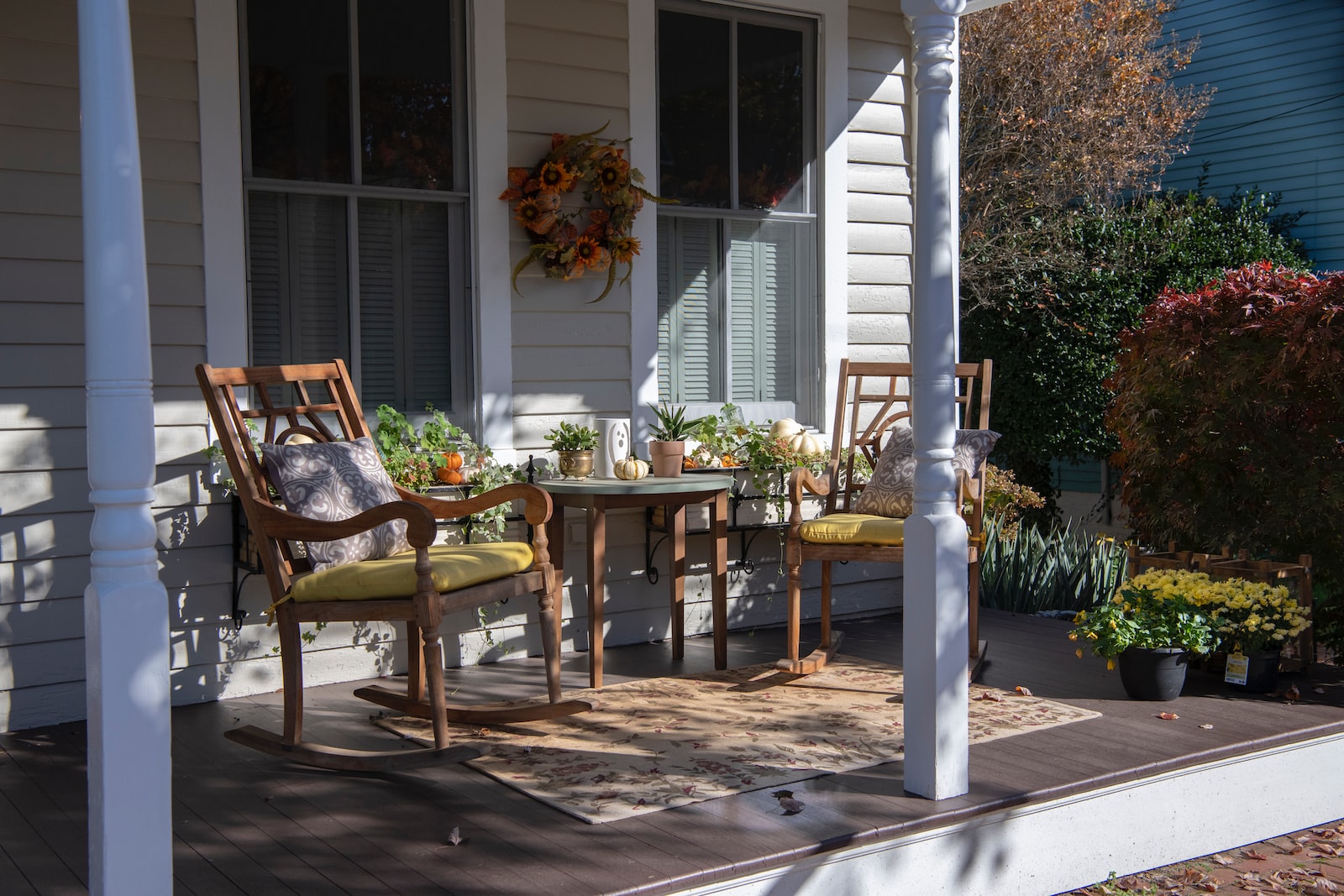
How do I create a cohesive porch color scheme for a small porch?
Creating a cohesive porch color scheme for a small porch can be a fun and exciting project that can transform the look and feel of your outdoor space. When choosing a color scheme, it is important to consider the style and architecture of your home, as well as the existing colors and materials used on your porch.
Start by selecting a primary color that will serve as the foundation for your scheme. This color should be chosen based on your personal style and preferences, but also take into account the existing colors and materials on your porch. You can then choose 1-2 secondary colors to complement your primary color and add depth and interest to your scheme. Consider using these secondary colors on accent pieces such as pillows, rugs, or planters.
Another important factor to consider when creating a cohesive porch color scheme is the balance of warm and cool colors. Warm colors such as reds, oranges, and yellows can create a welcoming and cozy atmosphere, while cool colors such as blues and greens can create a calming and relaxing atmosphere.
It is important to strike a balance between these two types of colors to create a harmonious and cohesive color scheme. Additionally, consider incorporating natural elements such as wood, stone, or plants to add texture and depth to your porch. With careful consideration of these factors, you can create a beautiful and cohesive porch color scheme that will enhance the beauty and functionality of your small porch.
What are some porch color schemes for a rustic look?
When creating a porch color scheme for a rustic look, it is important to choose colors that complement the natural elements of your porch, such as wood, stone, and brick. One popular color scheme for a rustic porch is earth tones, such as beige, brown, and green.
These colors create a warm and inviting atmosphere that is perfect for a cozy, rustic porch. Consider using these colors on your porch flooring, furniture, and decor items.
Another popular porch color scheme for a rustic look is a neutral color scheme, such as white, cream, and gray. These colors create a clean and fresh look that is perfect for a modern rustic porch. Consider using these colors on your porch walls and trim, and pair them with natural wood accents for a warm and cozy feel.
You can also add pops of color with accessories such as colorful throw pillows, rugs, and planters. With careful consideration of these factors, you can create a beautiful and inviting porch color scheme that will enhance the rustic charm of your porch.
Which porch color schemes work best for a farmhouse-style porch?
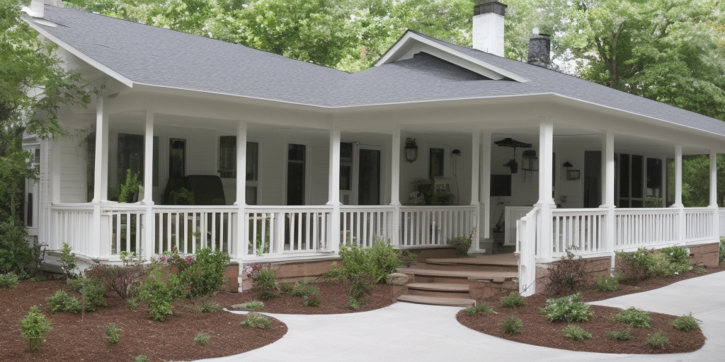
A farmhouse-style porch is all about creating a cozy, welcoming atmosphere that blends traditional and modern elements. When choosing a porch color scheme for a farmhouse-style porch, it is important to select colors that complement the natural elements of your porch, such as wood, stone, and metal.
One popular color scheme for a farmhouse-style porch is a neutral color scheme, such as white, cream, and gray. These colors create a clean and fresh look that is perfect for a modern farmhouse porch. Consider using these colors on your porch walls, trim, and furniture, and pair them with natural wood accents for a warm and inviting feel.
Another popular porch color scheme for a farmhouse-style porch is a pastel color scheme, such as pale blue, green, and pink. These soft colors create a calm and soothing atmosphere that is perfect for a relaxing porch.
Consider using these colors on your porch flooring, furniture, and decor items, and pair them with natural wood and metal accents for a rustic feel. You can also add pops of color with accessories such as colorful throw pillows, rugs, and planters.
With careful consideration of these factors, you can create a beautiful and inviting porch color scheme that will enhance the farmhouse charm of your porch.
Final remarks on porch color schemes for a cohesive look
In conclusion, if you want a porch color schemes for a cohesive look these ideas are sure to make a big difference. When you choose the right porch color schemes, you can create a cohesive look that ties everything together. By keeping a few things in mind, such as choosing colors that complement each other and using accents to tie everything together, you can create a space that is both inviting and visually stunning.
So go ahead and experiment with different color combinations until you find the perfect porch color scheme for a cohesive look that reflects your personal style and adds to the overall beauty of your home.